VanMoof Service Hub OS
Josh Ellis
Fullstack Developer
Myles Palmer
Founder & Creative Director
Introduction
VanMoof was founded in 2009 by two Dutch brothers who had the vision of the perfect city bike. With over 200,000 riders and a planned expansion of more than 50 e–bike stores worldwide, they are redefining the future of urban mobility and leading the wave of new e–bike riders across the globe.
We were brought on by creative consultancy Modem to create a digital installation inspired by their brand signature dot-matrix for the opening of VanMoof's new global service hubs that they had designed.
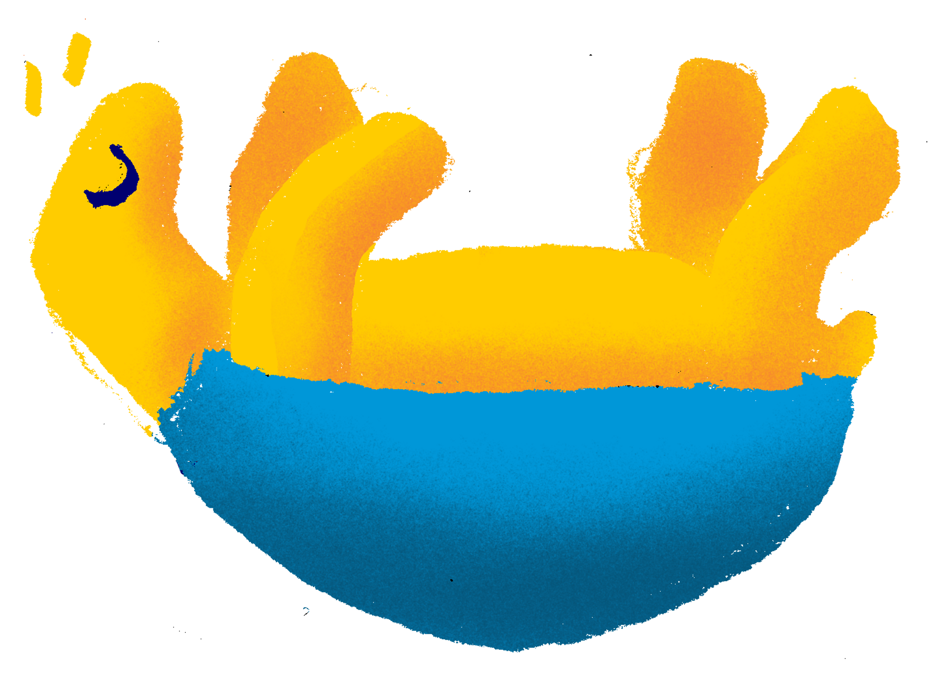
Early typographic experiments for how we could use VanMoof's signature dot matrix to create typographic expressions.
The Brief
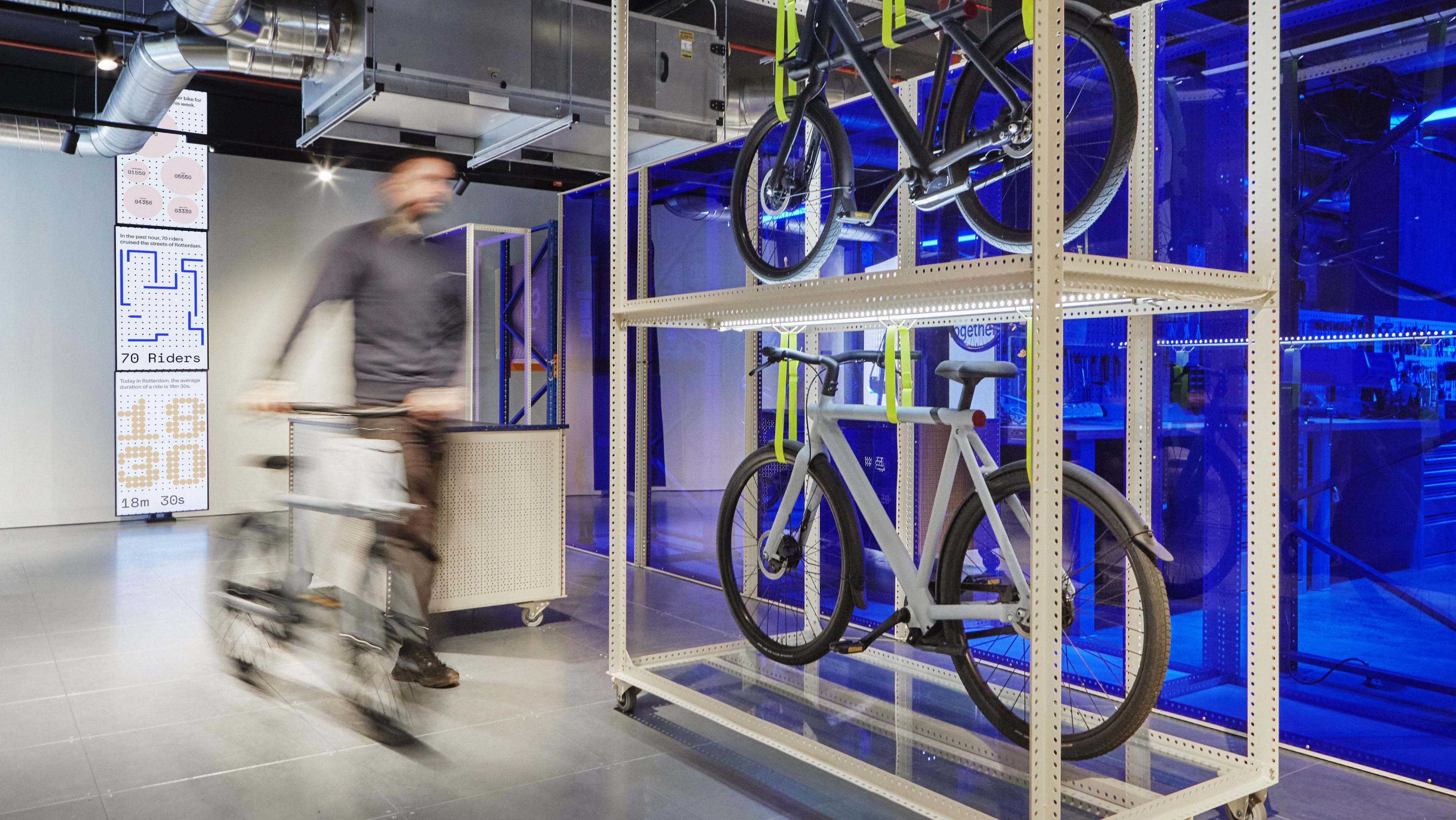
VanMoof’s state-of-the-art service hubs anticipate everything their riders may need, from test rides to repairs.
To mark the opening of 14 international Service Hubs, we created a new store experience supported by a newly developed API from the VanMoof team.
This data enabled us to visualise on a per store basis the behaviours of VanMoof riders in each city, showing who is out on the roads right now, how far they have ridden that day, the city's collective impact that week, and the impact VanMoof riders are having around the world.
It was our task to surface a compelling narrative with this data through bespoke software, a dynamic visual language informed by the physical product, and a modular design system to deliver flexibility for the future across beautiful, seamlessly connected vertical video walls.
We experimented a lot with what the right level of data visualisation was — from very abstract to the more technical and literal.
How do you visualise rider data without feeling intrusive?
Our starting point was exploring the tension between the explicit — the literal representation of the data — and the ‘abstract’, or, how to interpret that data in a way that was visually engaging and told a compelling story.
In search for the right balance we examined the data in detail. Ensuring the rider data remained anonymous was of the upmost importance, riders in the store had to feel the data was relevant to them and accurate, but not be able to identify themselves in the context of the visuals.
We therefore dialled down the literal representation of a single ride in favour of drawing attention to the community of VanMoof riders and the impact they make as a collective.
Whilst exploring how the system could be modular across the stack of TVs, we visualised each data point being a 'node' that could stack and morph down the screen.
We produced various experiments of how the modules and moments transition between data visulisation could occur, here for example they were envisaged as 'nodes' that grew and shrunk over time.
Different cities ride differently and we needed to bring that to life.
Now that we were focusing in on the collective impact, we needed to define our metrics. The obvious one, speed, was out — as riders can be capped at different speeds depending on where they live in the world.
The duration of rides could be precisely determined and proved to be a more compelling measure of rider’s behaviour in different cities, as well as their broader impact globally.
Rather than go for a painstakingly precise representation of data like it was a spreadsheet, we wanted to be able to use some ‘narrative license’ in the visual expression to represent data.
This was an early (and hacky) browser prototype of how we could create a 'data stream' that felt alive. This demo gave us the proof it looked great to follow through.
Design System
We wanted the installation to blend the technical nature of VanMoof products, such as the LED dot matrix, with the freedom and connection with nature that electric bikes bring.
Using waterfalls as our reference point of a fluid and wondrous spectacle, we designed the interlude between the modules of rider visualisation to be this 'fall' of dots that fixed your gaze and mesmerised the visitors to the store.
Outside of this, we decided that dots would represent riders and lines would represent distance — giving grounding to all of our visualisations.
All of this was combined to create a flexible visual language capable of embodying each data point, local or global, with a unique animated expression.
All of the modules started to come together and express the individual parts of data in an innvovative, engaging way.
We worked to carefully balance expression with rigid, data-like structures.
Starting with type, we sought a balance between a sense of the abstract, consonant with the installation format, and the importance of legibility, to ensure the stories that the data told could be read and understood.
Initially, we explored how type might be derived from VanMoof’s signature dot matrix itself, looking at how the dots might animate and merge together to take the form of letters or numbers on the screens.
However we also needed to consider how type would transition between frames within the installation, and so a more staid choice of typeface to clearly convey messaging was preferred.
This gave the dots freedom to take an animated, playful form, and herein we found our balance of the explicit and the abstract.
The CO2 saved is calculated by using an EU calculation that compares the distance ridden by bike to what the emissions would be if the same journey was taken by car.
Technical Approach
To realise this ambitious vision, it required a technical solution that was performant at scale, flexible and was able to run on micro dedicated machines behind the TVs.
We used React-three-fiber, a React reconciler for three.js, and a WebGL abstraction library built in Javascript alongside React. We also built a small Node.JS server to handle fetching the data from the VanMoof API, using Express.
To support this, we used Sanity as the CMS solution to manage the data modules that VanMoof wanted to show in each store.
These elements came together to form a FullStack JS application that ran in Chrome and met our needs, but not without a handful of challenges to overcome.
The dot background represented one such challenge. We couldn’t realistically render infinite meshes (circles) as this would consume too much memory, as the dots wouldn’t be used again after they’d disappeared off screen.
Instead, we created the illusion of infinity by rendering enough dots to cover the screen in rows, which would then move back to the top of the queue once a row had left the viewport — which was significantly more performant.
At the time of making there lacked an immediate solution available in WebGL to animate lines with curves and points, so we opted for a combination of half webm videos that could support transparent backgrounds, and half real-time animations built in code — we were able to be more expressive where we wanted to this way and not have to reinvent the wheel on a tight timeline.
As it’s one long animation, careful orchestration of animation was required, so we used React-spring, the Imperative API and onRest events to sequence the animations, with zustand used to control the whole sequence.
To be most performant, we needed to keep the rendering of WebGL to a minimum. Therefore we rendered everything in one go, hiding meshes and elements where they weren’t needed to sustain a smooth animation throughout.
We are greatful to all collaborators & freelancers that worked on this project with Companion such as Modem and Gianluca Alla 🧡.
“A feeling of fellowship or friendship is indeed how we would define our collaboration with Companion. Beautiful people that produce beautiful work.”